

Improve how items are added to a document
What was the problem?
Adding an item is the most common task when creating documents. It needs to be frictionless. After a major release customers felt it was taking longer to create documents. The feedback wasn't very specific and we found it hard to measure or target one problem area.
The goal was to address the key issues quickly and so we took a lightweight approach.
How it impacts Pete the Plumber
Using existing research and customer feedback we created a scenario to capture the primary use-case. We use scenarios to drive design decisions and validate concepts.
Pete's just jumped into his truck after meeting with a client to discuss a new job. It's a rush job, there's a lot to do, and Pete wants to send the job details to the client today. He uses his notes to add everything he needs into an estimate for the job.
Reviewing the current task flow
The first step was to perform an expert review of the system to uncover the key usability issues. We used the 10 usability heuristics to evaluate the task flows from our scenarios. We also timed the task for a common document to benchmark the experience.
The key findings that we wanted to address were:
- the conceptual model was confusing and hard to predict
- similar objects behaved differently than each other
- the system was very flexible which created complexity
- labelling was terse and didn't guide people through the task
- important controls were often hidden behind the keyboard
- on-screen animation was erratic and didn't support the task
- lots of small inconsistencies detracted from the experience
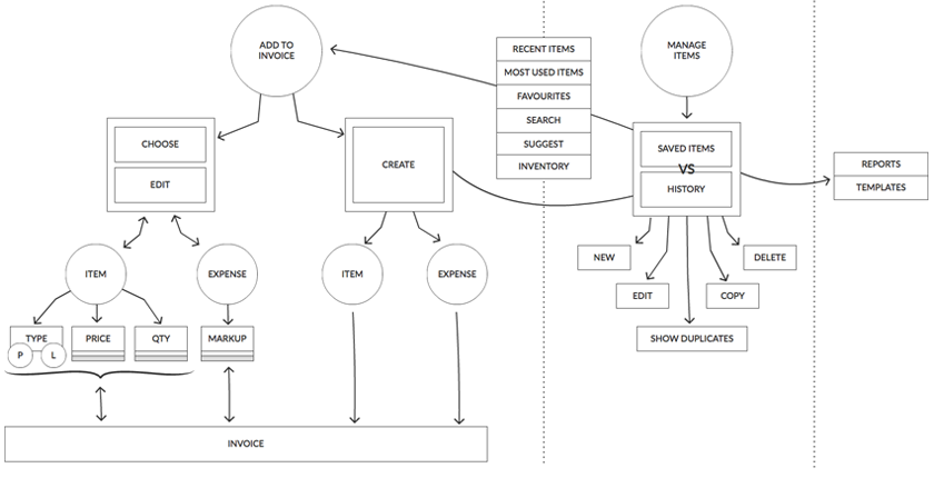
Mapping the conceptual model
We addressed the complexity and inconsistencies in the system by whiteboarding the current model. Creating this model helped align the wider team and was the first step in creating a new conceptual model.
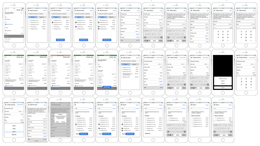
Screen designs for task flows
We produced screen designs for all task flows. These were driven by feedback from customers, findings from the expert review, and the conceptual model. This is where we spent the majority of our time for this project.
What we changed
We changed the way mulitple items were added by removing the need for an 'add multiple' mode. We simplified the flow for the most common use case and guided customers with messaging. Forms were redesigned to display the most important elements above the keyboard. Labelling was revised to match customers language and to reflect the action and resulting outcome. The majority of animation issues were solved by managing the focus of form elements.
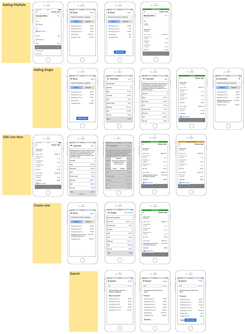
Reviewing the flow and interaction
To model the task flow and get a feel for the interaction between pages we created a simple prototype. The prototype was also used to brief other teams on the improvements to the task flow.
Add items prototype (PDF)